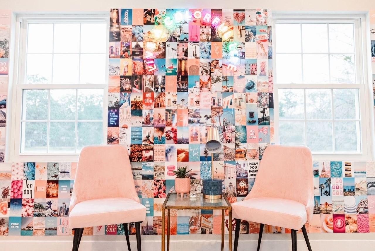
You may have noticed many beauty salons setting up salon “selfie walls” – colorful and cute walls where happy customers can easily snap a pic to post to social media.
Selfie walls are a win-win: Your customers get to post a fun picture about what a great time they had at your salon. And you get to reach their followers – people who may not otherwise know about your business. Plus, you can re-post customers’ photos, filling your social media feed with happy customers.
In marketing speak, those selfie wall posts are known as ‘user-generated content’, or UGC – and they’re an important part of your business’s social media plan. So we put together a how-to for creating your own selfie wall… and rounded up a few of the best salon selfie wall ideas we’ve seen.
salons setting up salon “selfie walls” – colorful and cute walls where happy customers can easily snap a pic to post to social media.
Selfie walls are a win-win: Your customers get to post a fun picture about what a great time they had at your salon. And you get to reach their followers – people who may not otherwise know about your business. Plus, you can re-post customers’ photos, filling your social media feed with happy customers.
In marketing speak, those selfie wall posts are known as ‘user-generated content’, or UGC – and they’re an important part of your business’s social media plan. So we put together a how-to for creating your own selfie wall… and rounded up a few of the best salon selfie wall ideas we’ve seen.
Picking the Right Spot
Start by thinking about how clients move through your space during a visit. Which areas do they hustle through on their way to a shampoo? Where might they linger for a few minutes? And where are they most likely to want to be photographed? (Probably not while their head’s under a dryer, for starters.)
Put that all together, and your reception area might be a good candidate for your selfie wall. Clients probably stop by at least twice during their appointment, once when checking in and once when checking out – in other words, when they’re feeling their best. So why not deck out that space with extra-special reception desks and customer seating – like our Allure Reception Chair or Galaxy Reception Desk w/ LED Lights?
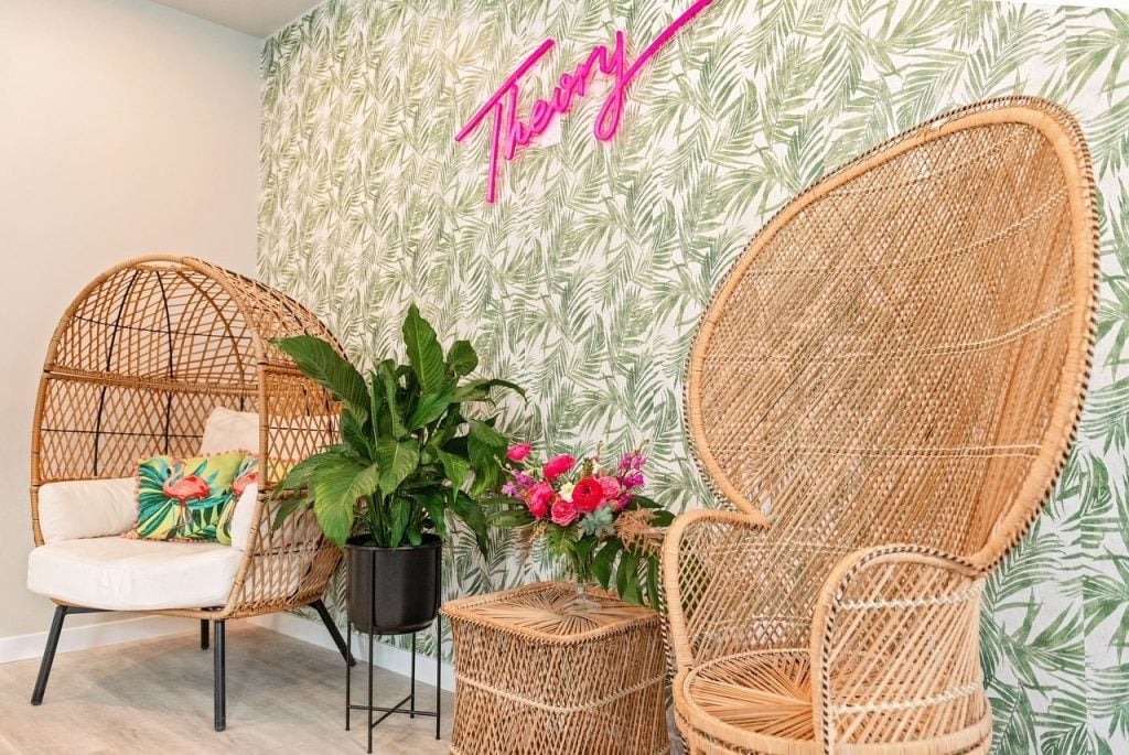
For an idea of what this looks like in practice, we turn to our friends at Theory Collective Salon in Charleston, SC. With just a few wicker pieces, a single wallpapered accent wall, some plants and a neon sign, they’ve transformed a waiting area into a perfect spot to snap a pic.
Another pro tip for picking the right location: If the golden rule of real estate is location, location, location – for selfie walls, it’s lighting, lighting, lighting. Pick a wall that’s drenched in natural light and set up your wall there.
Tricky lighting at your salon? No problem. You could always invest in a ring light. Ring lights make everyone look good - and there are tons of options out there for every budget.
Keep Your Brand Front and Center
When you’re designing your selfie wall, think about your brand. Are you the go-to salon for vivid color and bold cuts? Try a quirky wallpaper or bold shade of paint. More about the elegant updo? Maybe velvet and golds are for you.
Remember, the goal is for your customers’ posts to reach people who haven’t ever heard of your business before. It’s important that your selfie wall gives an accurate first impression of your salon.
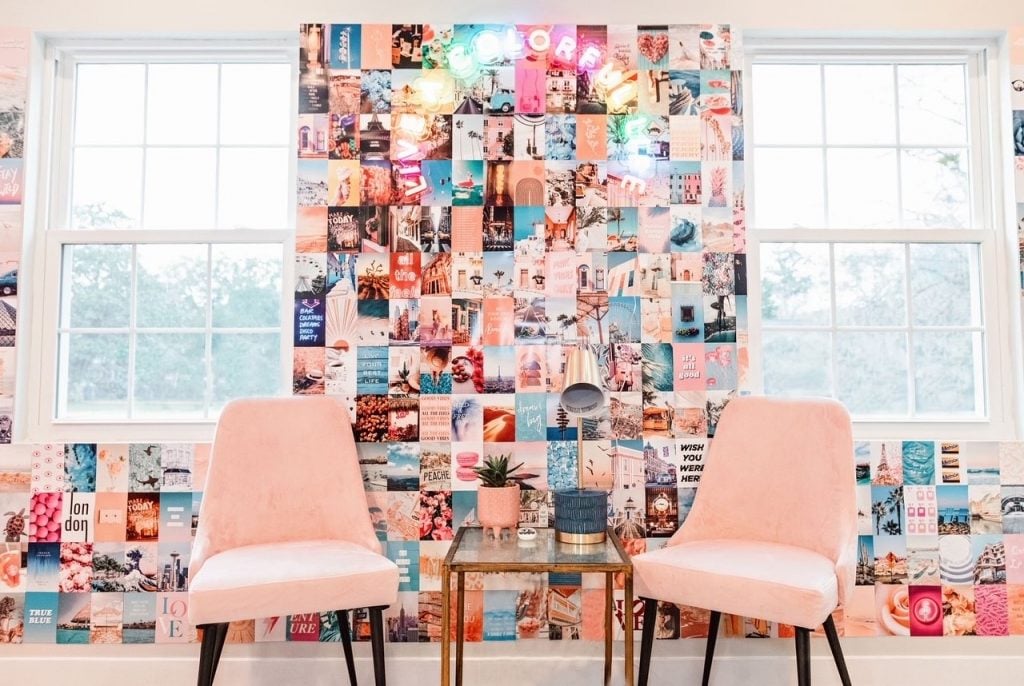
In another corner at Theory Collective, our friends picked a bright spot with lots of natural light, decorated with images of adventure and a whimsical neon sign, and popped in some colorful accent chairs. The result is a wall that fits right into Theory Collective’s brand identity – and practically begs for a selfie!
You can spend as much or as little as you want to, as long as you’re creative and make sure to remind customers to tag you!
Buy-Rite is here to help you design and build your salon selfie wall – and achieve all your other goals for your business, too. You can access our unmatched service here, and you can shop Buy-Rite equipment here.
